La Foulée Purpanaise, athletics club logo
Friends and sport
The deliverables
- Client
- La Foulée Purpanaise (personal redesign, not commissioned)
- Sector
- Athletics club
- Location
- Toulouse, France
- Year
- 2026
- Deliverables
- New logo (badge, standalone bull, oval), wordmarks, palette, jersey, posters, meet tickets, race bibs, badges, membership card, apparel and merchandise


The context
The logo of La Foulée Purpanaise, an athletics club in Toulouse, which I drew years ago, redesigned on my own initiative: the bull, the red and the yellow stay, everything else gets simpler.
From the old logo to the new one
The shift from one version to the other, shape by shape. Drag the slider to go back.
The stripes and laurels fade away
The bull stops leaping and settles
The name wraps around the badge
An oval frames the bull
Old logo
New logo
The creative response
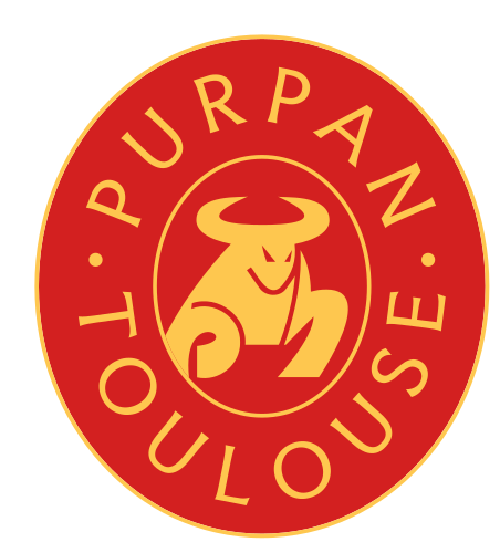
The new bull sits, head high, horns wide: it no longer runs, it holds its ground. The club's name no longer bends into an arc but wraps all the way around the badge, and the central oval works on its own whenever space runs short.


The badge then lands on everything that makes up club life: meet tickets, membership cards, race bibs, sign-up posters, apparel and stand merchandise. The slider above shows each step: the stripes and laurels fade away, and the bull stops leaping. Three forms take turns depending on the space available: the full badge, with Purpan Toulouse around it, the standalone bull and the compact version in its oval. They appear on the 'Entrée' ticket, the 'Licencié' badge, the four posters and the bib pinned to the singlet.


The jersey
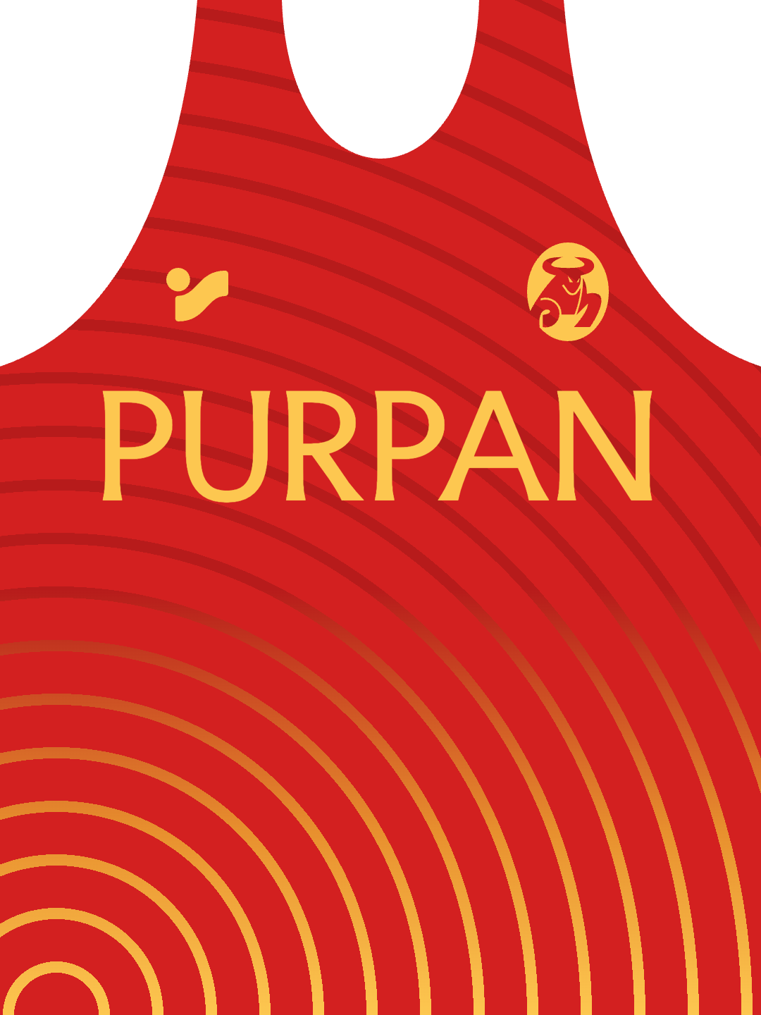
On the front, PURPAN in large letters and the bull over the heart. On the back, the badge. All around, concentric waves that echo the lanes of the track. Give it a spin.
On the track and in the stands, the bull becomes a rallying sign: jersey, tracksuit, flag, scarf, cap, water bottle.


Typography and colours
The wordmarks and the jersey are set in Faculty Glyphic. The bull, the red and the yellow are the three elements kept from the old logo. The badge and the standalone bull appear in yellow on red, while the compact version reverses the relationship, with a red bull in a yellow oval. The singlet is red, with PURPAN in yellow across the chest and yellow concentric waves. The same pair of colours dresses the tracksuit, the scarves, the embroidered cap, the water bottle and the large flag with the yellow bull.


The result
This redesign was not commissioned: I carried it out on my own initiative, starting from the logo I had drawn for the club years ago. The new logo, the wordmarks, the palette, the jersey, the posters, the meet tickets, the race bibs, the badges, the membership card, the apparel and the merchandise shown here are all part of this personal undertaking. The club did not adopt it and still uses the old logo: this redesign remains a personal proposal. All the photographs shown were generated with AI for La Foulée Purpanaise.
Next project

Gemini
Let the stars guide your evening